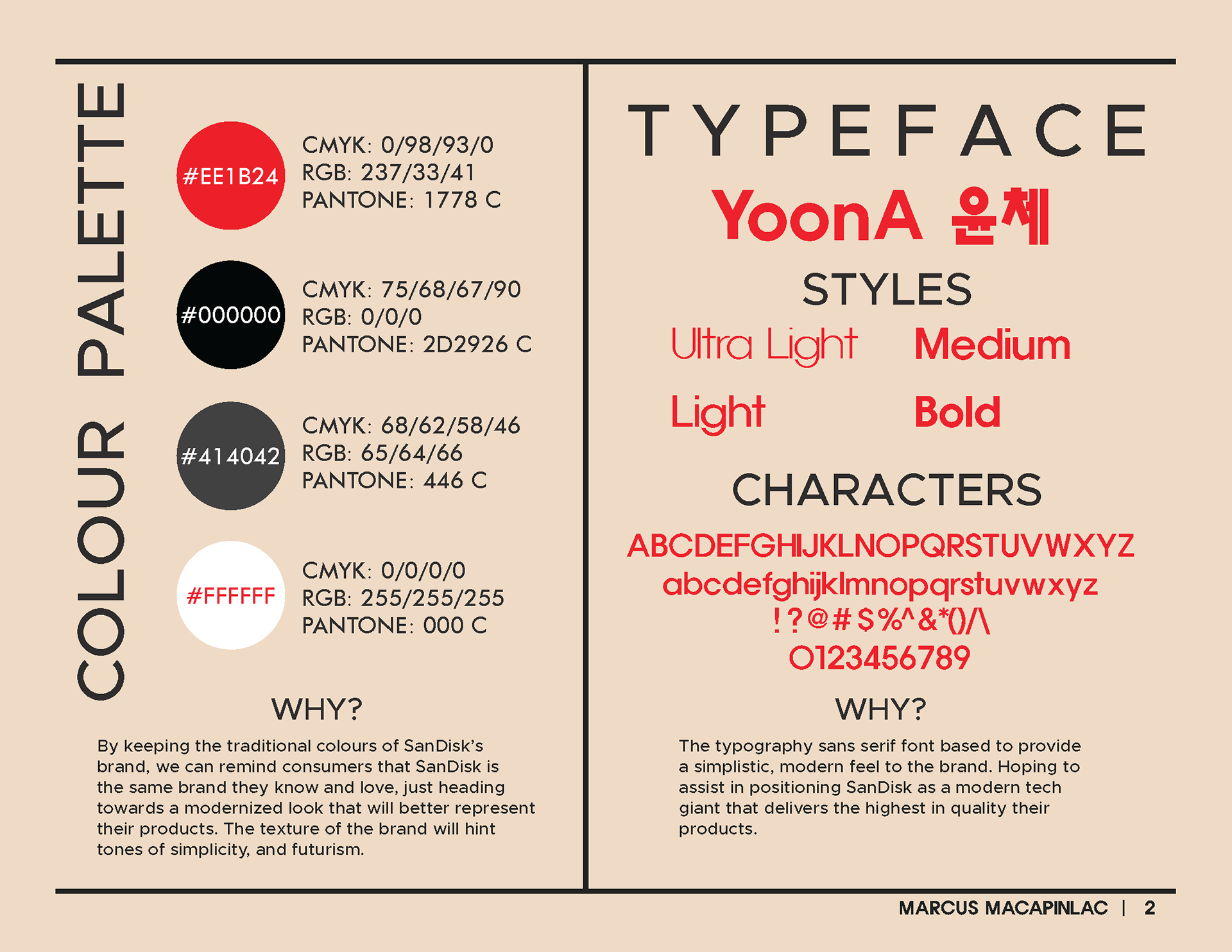
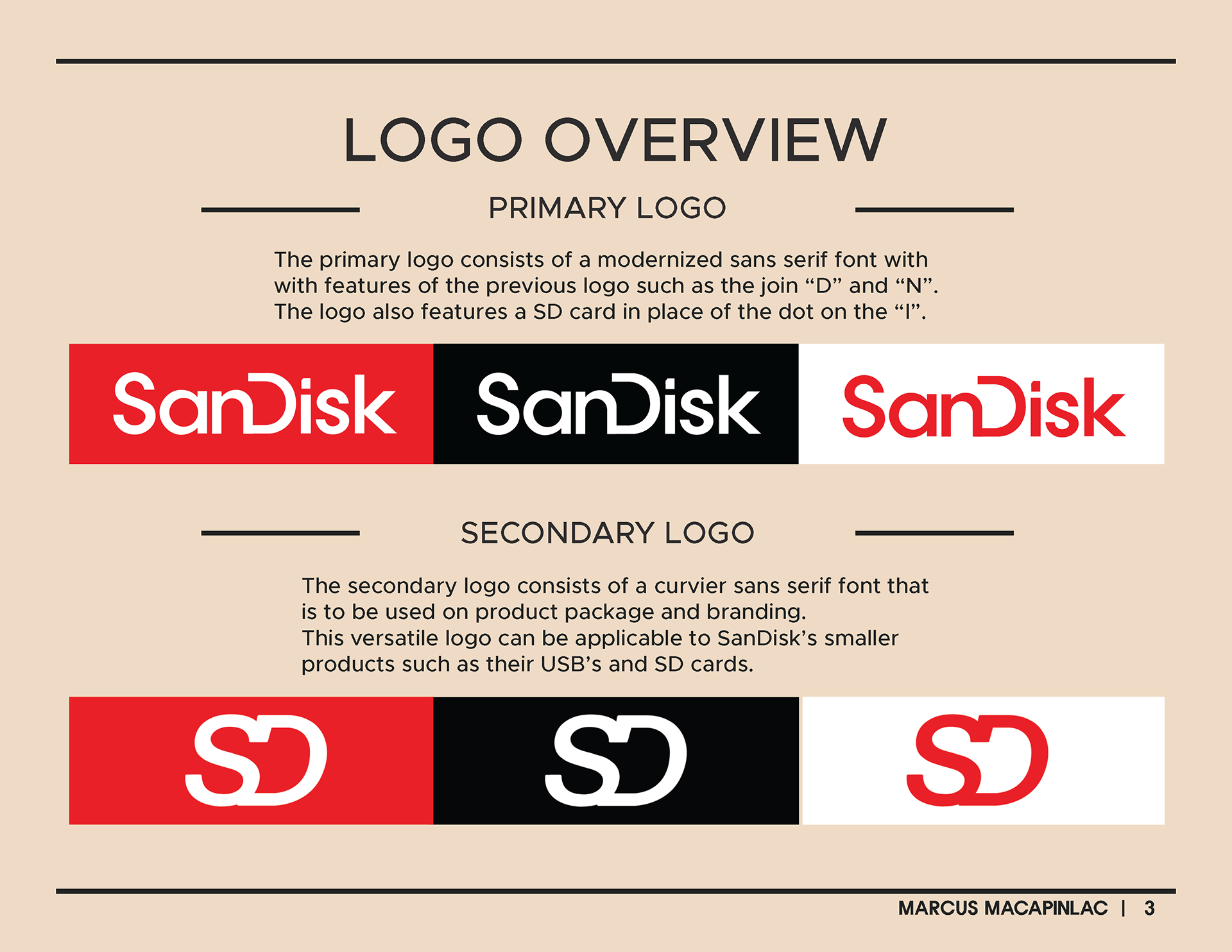

For this design, my thought process was to modernize the SanDisk brand, to help consumers view them as the innovative company they are. With the idea of using a Sans Serif font to communicate this as well as incorporating the shape of their SD card into the "i" of their logo as they dominate the storage market.

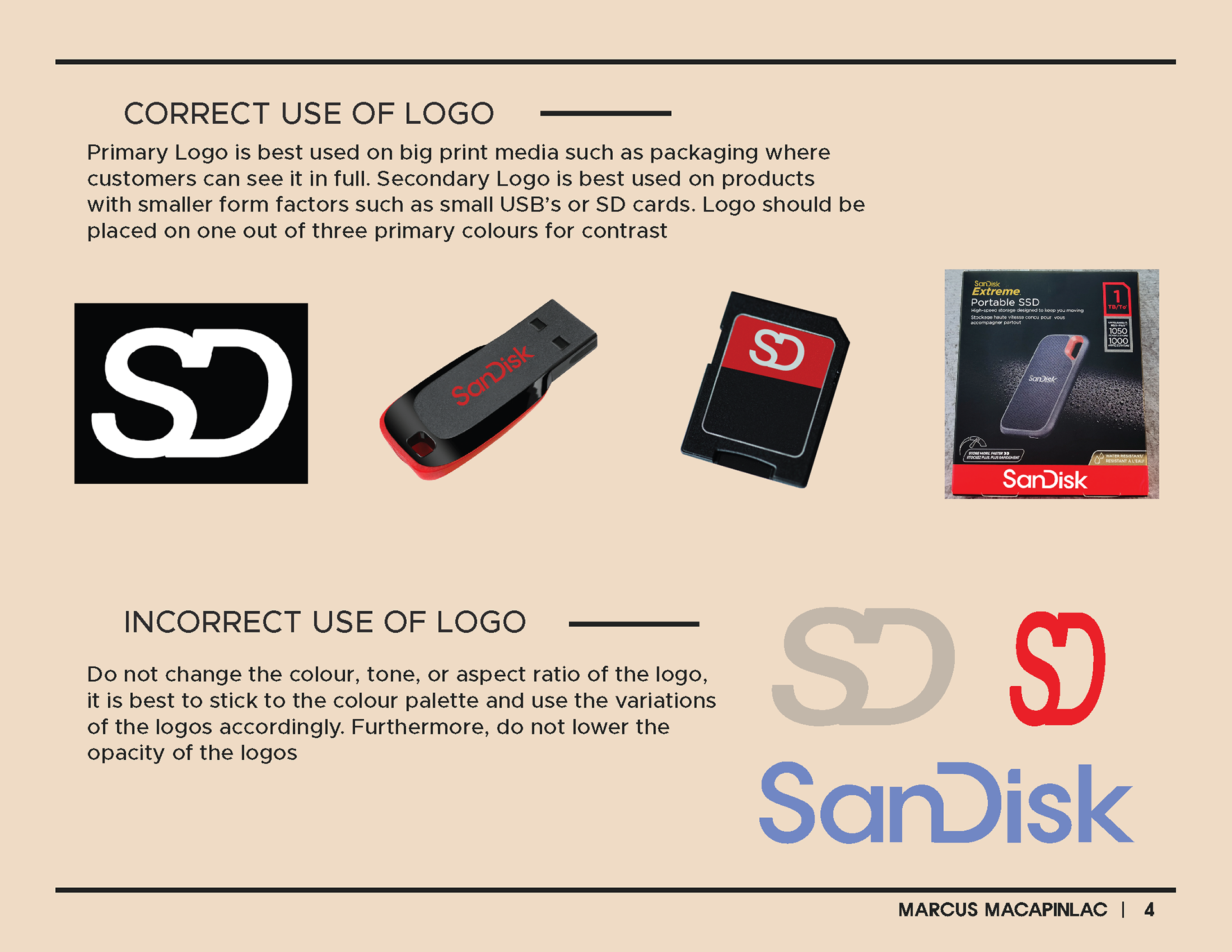
This Secondary Logo could be utilized on SanDisks smaller objects such as their SD cards.